Best Charts for Intraday Trading: Intraday trading is a very different sort of trading technique.
Intraday trading is the buying and selling of stocks on a single day and also booking your profits on the very same day.
For intraday trading, you will need to check the charts and also go for technical analysis.
What are intraday trading charts?
- Intraday trading charts will depict the ways in which price movements are expressed over a period of time.
- These trading charts are considered very crucial for the entire trading arsenal.
- These charts are effective in decision-making and they are also useful for analyzing short-term, medium-term, and even long-term periods.
- These charts will also help to depict the fluctuation of the stocks and will also give a detailed performance of any particular stock that you choose.
- These charts are commonly used for intraday traders.
Types of intraday trading charts:
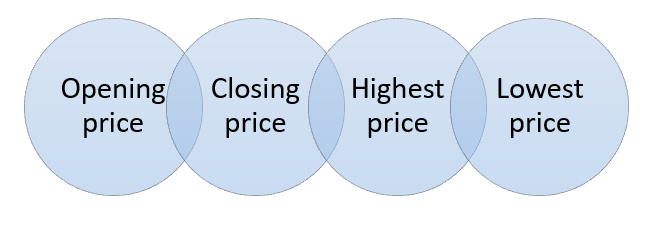
Intraday trading charts are a combination of the following three factors:

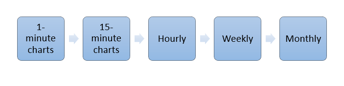
These intraday trading charts can be of the following time frames:
Top 6 Best Charts for Intraday Trading:
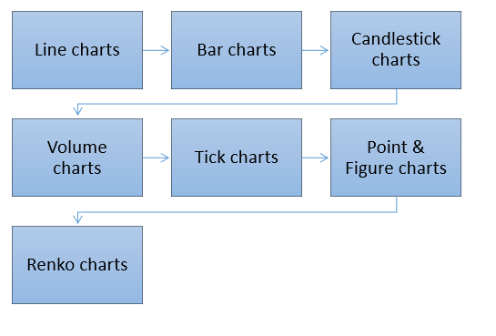
1. Line charts:
- Line charts are considered to be one of the simplest trading charts that have a time base because each data point on the chart is from a fixed time period.
- They are formed by joining the closing price of the security in each time period and then forming a line for the same.
- They are highly significant for observing the long-term trends and also observing the heads and shoulders pattern.
- This chart pattern is not very helpful for day traders because it will not provide much precise information about intraday price movements.
- The following is the line chart:

2. Bar charts:
- Bar charts are time-based intraday trading charts.
- For each time period, they will use the following to build a price bar for the specific time period:
- These charts are also known as OHLC charts.
- Each bar here is made up of a vertical line that joins the highest and lowest prices with a short horizontal line that will extend left at the opening price and a short horizontal line that will extend right at the closing price.
- They are also colored green or red so as to indicate the net gain or net loss in intraday trading at the closing price.
- The bar chart is as follows:

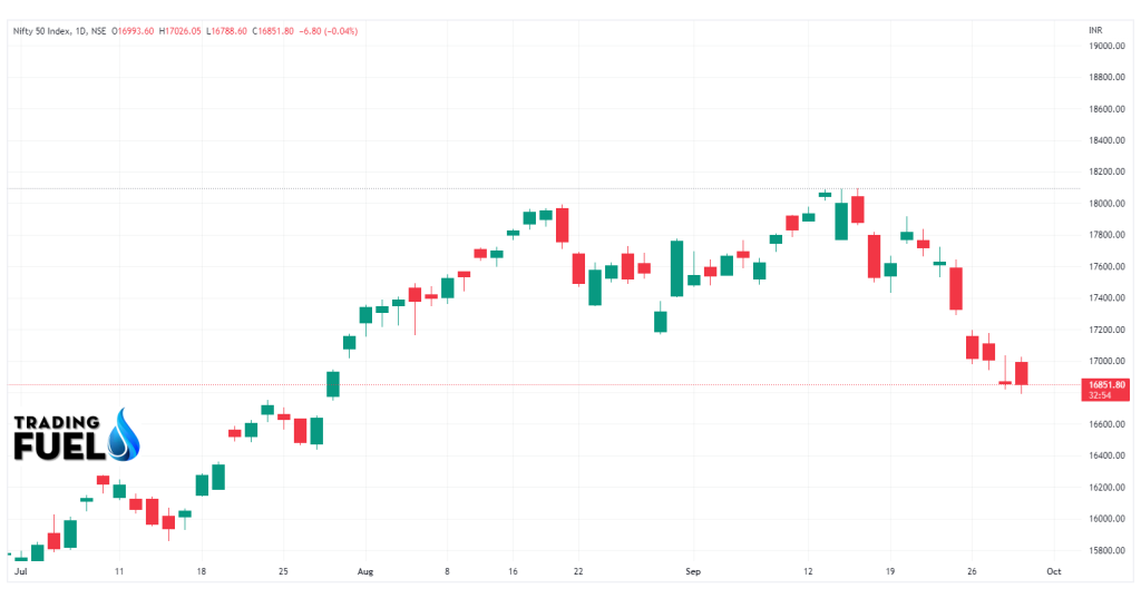
3. Candlestick charts:
- Candlestick charts are very much like bar charts because they also depict the same values.
- However, here there is an enlarged region between the opening and closing price, which will form the body of the candlestick chart.
- This is the most commonly used chart that is used in intraday trading.
- The candlestick chart consists of the following:

- Here also, just like in bar charts, the body is either colored red or green, and that will indicate a net price drop or a net price rise from the closing price.
- When the closing price is more than the opening price, a bullish candle will be formed. When the opening price is more than the closing price, a bearish candle will be formed.
- The traders here look for specific pattern formations in this chart as their trade signals.
- These charts tend to provide more information than line charts, but they also occupy more space than bar charts.
- The candlestick chart is as follows:
4. Volume charts:
- Volume charts will be using the level of market activity as their base instead of time.
- These charts will depict the volume, which is the number of contracts or shares that are traded in the market.
- Here, instead of OHLC data for a specific time, the data is taken for the volume block.
- Hence, the volume of the market will be represented as bars or candlesticks, and they will each represent a fixed volume.
- When the market is slow, the chart will also slow down and will also present less sideways movement.
- These charts can also not be used to confirm a breakout.
- The volume chart is as follows:

4. Tick charts:
- Tick charts are based on the level of market activity.
- Tick charts will use ticks or the number of transactions as an indicator of market level activity instead of using volumes.
- These charts will represent a number of transactions, and each transaction has a different volume, so the data shown by them is very much different from the volume charts.
- Here, the bar or candlesticks are formed, and each bar or candlestick will show an OHLC for a specified number of transactions.
- The number of ticks will be dependent on the volatility of the market, but the most common options are 144-tick and 233-tick settings.
- This chart will work well in a market with strong trends.
- The tick chart is as follows:

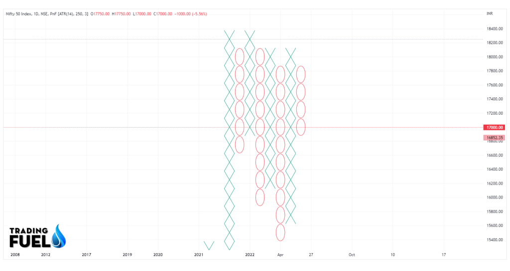
5. Point & Figure charts:
- Point and Figure charts are simple but effective trading charts that highlight only significant price movements.
- The chart will depict the movement of the market in the form of X’s and O’s, where X will depict rising prices and O will depict falling prices.
- The symbols are placed in a box that will represent an incremental time period, like one day or a range of days.
- The only thing to be done is to specify the box size and the reversal amount.
- The unique feature of this chart is that the input is not used on a linear basis because as soon as the price rises or falls beyond a certain level, a new column will be made.
- The point-and-figure chart is as follows:
6. Renko charts:
- The word Renko is derived from the Japanese word ‘brick’.
- Hence, Renko charts will show the bricks and hence the brick size needs to be specified.
- A new brick will be formed when the market moves more than the brick size away from the preceding brick size.
- This chart will not show the exact price action but will only highlight the important trends after removing all the surrounding noise.
- Hence, Renko charts are those charts that are helpful for identifying trends in a high time frame and also for guiding the trader and allowing the profits to run in.
- The Renko chart is as follows:

Advantages and disadvantages of trading charts:
The main advantages of trading charts are as follows:
- These charts are also used by day traders.
- They will provide information on the open, low, high, and closing prices for a specified period of time.
- They are easy to read as well as interpret.
- They will also represent the most fundamental data that is needed to make the decisions.
- They will also provide full information for every time frame.
- These charts will also work with almost all the technical indicators.
- They will also give you an insight into the best stock action.
- The charts are often interactive as well as customizable.
The main disadvantages of trading charts are as follows:
- Market gaps are not common.
- It will look different in each time frame.
- A few of the charts are not very simple to read.
- It is not easy for a new trader as he might get confused regarding the opening price and the closing price.
Conclusion:
We hope the above blog has given you a detailed understanding of the best intraday trading charts.
About Us:
Trading Fuel is our website for blogs where we give you knowledge about finance, economics, stock markets, intraday trading, and technical analysis. Stay tuned with us for more such blogs.
Frequently Asked Questions (FAQs)
Contain & Image ©️ Copyright By, Trading Fuel Research Lab