Good stock can be loss-making if you buy it at the wrong price, to avoid this you need to time the market and price chart help in timing the market.
Technical analysis is all about timing the market. Analysis of price is the first step in technical analysis, we look to identify market trends, the strength of the market, and momentum.
A chart price is the foundation of candlestick pattern and chart pattern,chart price provides trading signal or sign of future movement of the price.
In this article, we will understand what are the stock price chart and different types of price charts.
- Line Chart
- Bar Chart
- Candlestick Chart
- Volume Chart
- Point & Figure Chart
- Renko Chart
- Heikin Ashi Candles
- Line Break Chart
What are stock price charts?
The stock price chart graphically represents the movement of the price of underlying asset or how trading volume has changed over time.
The stock market chart is extremely useful to identify current trends and to develop an understanding of what is going on in the market.
The stock chart has two axis – the vertical and horizontal axis, the horizontal axis represents the specific period on which a technical chart is to be constructed. The vertical axis represents the price range for that specific period.
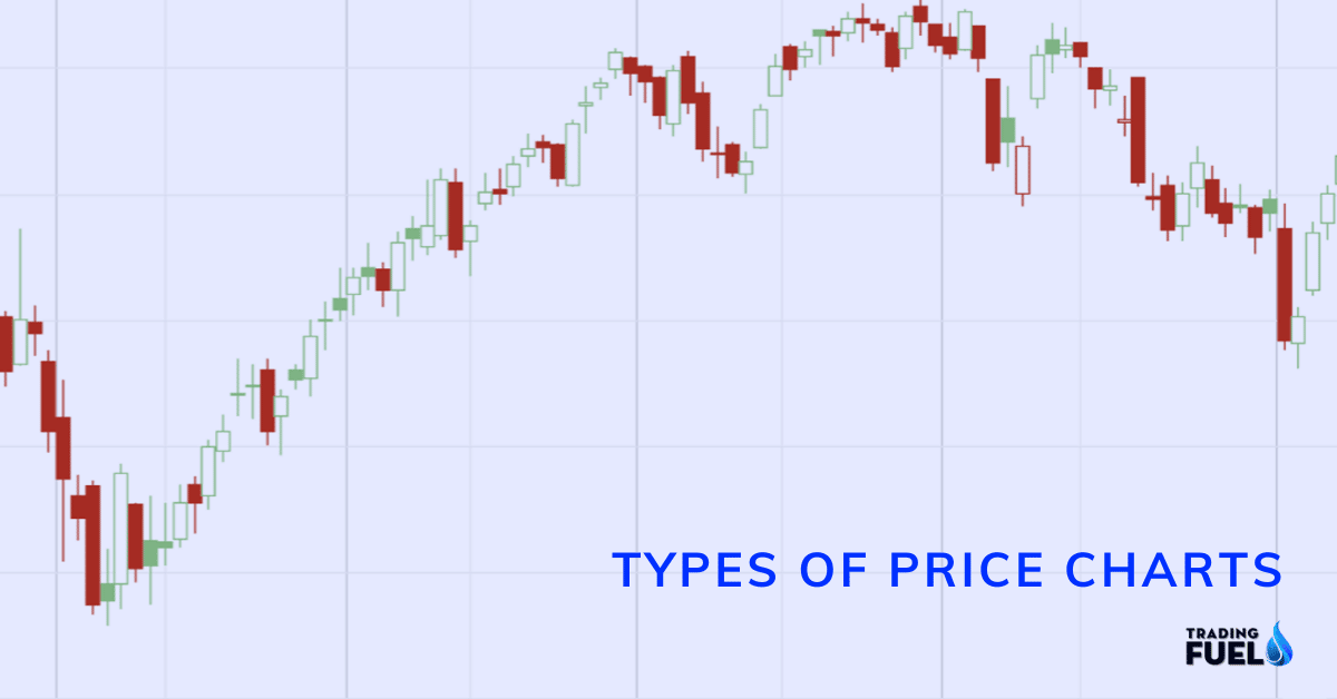
Types of Price Charts
#1 Line chart
It is extremely simple to construct a line chart, simply by connecting the closing price of the respective time frame.
A line chart does not provide much detail as it represents the closing price of each time frame.
But there are several other advantages of line chart such as identifying long term trends, observing chart patterns like head & shoulder and triangle.

#2 Bar Chart
A single bar contains the following pieces of price data from each period.
- Opening price
- Highest price
- Lowest price
- Closing price
With all these price levels available we can construct a bar chart for each time frame.
A bar chart provides various important details which are essential for timing the trades.
With the bar chart, we can study the bar range and various other terms derived from the high, low, close, and open of different bars.

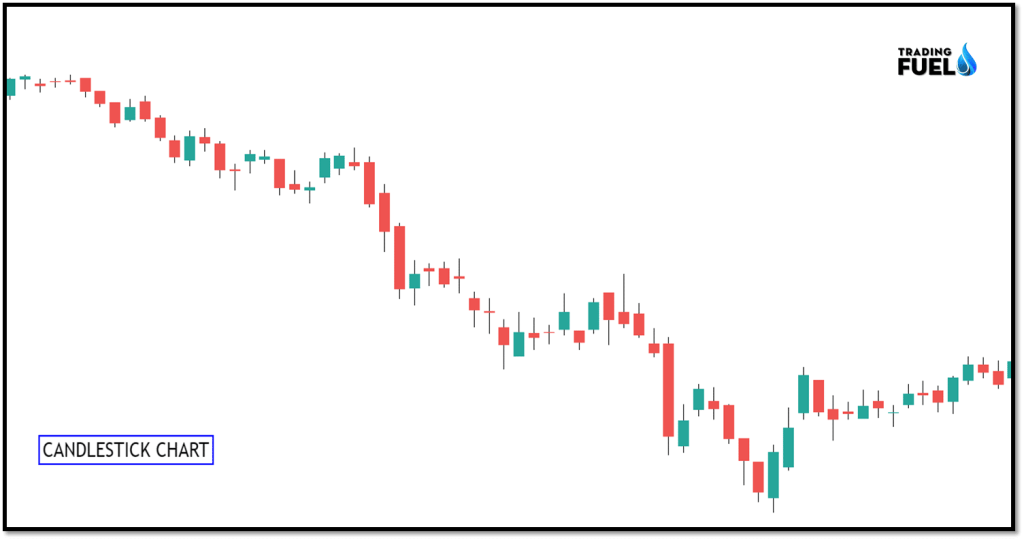
#3 Candlestick Chart
A candlestick has the same price data as a price bar except for the fact that the body is filled with either green or red colour depending on the closing and opening price relation.
The body of the candle is the range between the open and close price of the body.
Candlestick chart differs from the traditional bar chart.
The vast majority of day traders use candlestick because of their easy visual perception of price.
Red candle indicates the dominance of the bear in the market, as the price closed below its opening price.
Green candle indicates the dominance of bull in the market, as the price closed above its opening price.
There are several popular candlestick patterns which are extensively used in trading, some of them are as follows:
- Engulfing candles
- Harami candle
- Evening star candle
- Moring start candle
- Hammer
#4 Volume Chart
Volume: Volumeof a share represents number of contracts or share traded for a specific period.
Volume candlestick is a technical indicator that is a combination of volume and standard candle. It contains a wider and thinner candle depending on the volume for that period.
The volume candle contains additional information, the candle width. A candle width represents the trading volume for a specific period.
Using volume chart has many disadvantages such as:
- Looking for volume confirmation that supports the price.
- We can’t use volume spreads analysis.
- Using the volume indicator.
- Using volume to confirm the breakout.

#5 Point & Figure Chart
The first input to a point and figure chart is the box size. We will set the box size to 4.
The rise in the market is shown by X.
The fall in the market is shown by O.
When the market reverse we draw a new column, hence you can never see both X and O in the same column.

How to spot reversal?
The standard reversal amount is “3”.This means that for a rising column to end and falling column to start the market must drop by 12 ticks (3*4, box time*box size).
In the example below, we have used 5 minute time frame(for intraday), it means the chart is updated after the 5-minute close.Point and figure chart are most company used in daily and higher time frame.
The normal chart pattern which is widely used in the candlestick chart are also spotted in point and figure chart such are triple top, double bottom, triple top, etc.
#6 Renko Chart
Renko chart was developed by Japanese, in Japanese Renko means bricks.
New brick is created when the price moves a specified price amount and each brick is placed at 45 degrees compared to previous brick.
Up brick is either green or white. While the down brick is red or black in colors.
One must understand that the Renko chart does not display exact price action levels.
Renko chart leaves no room for candlestick or chart patterns analysis but it highlights the trend as it ignores the noise movement of the price.
Renko chart can be used for the following benefit:
- As a guide to run our profit, we can exit after spotting a reversal point in the Renko chart.
- Renko can be used to spot the trend direction on a higher time frame.

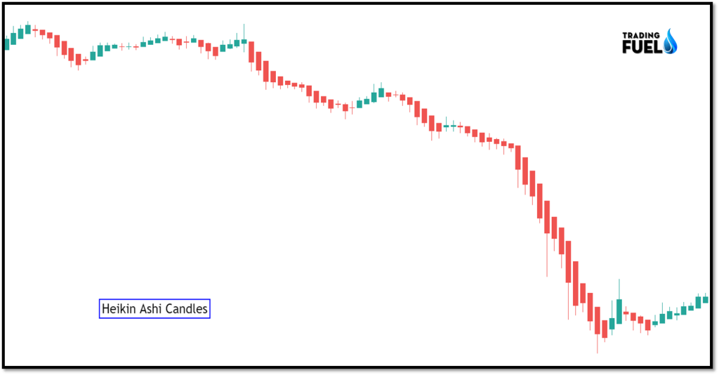
#7 Heikin Ashi Candles
Heikin-Ashi Candlesticks are fundamentally the same as the standard candlestick chart, yet vary in some key highlights.
- A Heikin-Ashi candle is green when the HA-Close is over the HA-Open.
- Heikin-Ashi candles are red when the HA-Close is underneath the HA-Open.
Heikin-Ashi Candlesticks close, open, high, and low values:
- Close(HA) = (Open Price + High + Low +Close) / 4
- Open (HA) = Average of Open Price and Close Price of the previous HA candle
- High (HA) = Maximum value of the (High of the Day, Open of HA, Close of HA)
- Low(HA) = Minimum value of the (Low of the Day, Open of HA, Close of HA)
- The drawback is that some valuable information is lost with averaging. The latest price may not mirror the real cost of the advantage, which could influence the hazard.
- Green candles imply an upturn, implies you should add to your long position, and quit your short positions.
- Candles with a little body encompassed by upper and lower shadows show weakness in the pattern.
- Red candles show a downtrend. Red candles with no higher shadows approve a solid downtrend. You should sit tight for a brief timeframe till there is a change in patterns
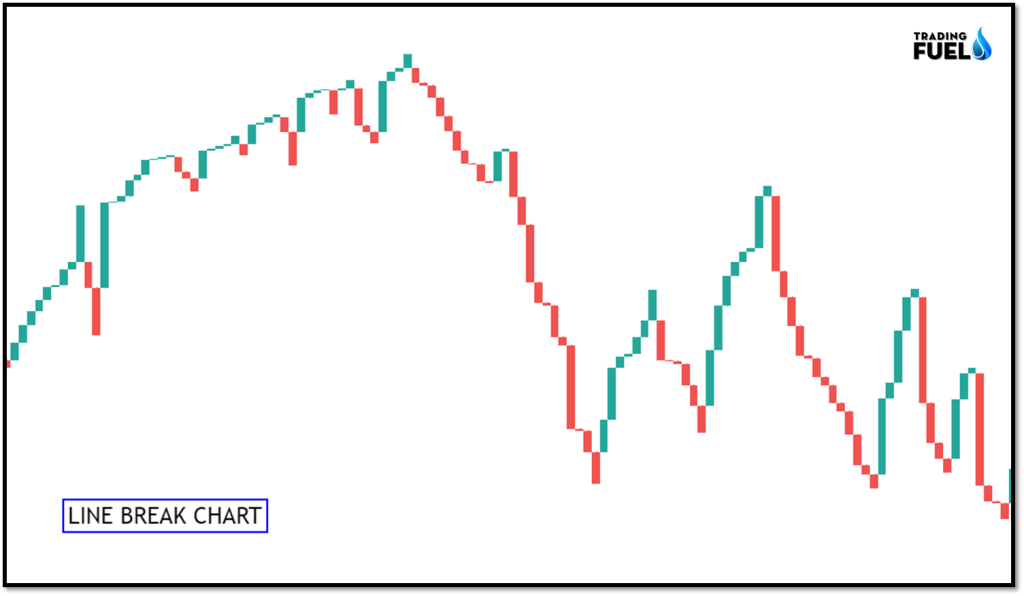
#8 Line Break Chart
Line break chart is constructed by a series of ups and downs, the key to using a line break chart is the user-defined number of lines setting. A line break chart takes the current closing price and compares it to the previous closing price of the line.
The most common line setting is 3, it means the closing price of the current line is compared to a closing price of line 2 period ago.
Line types:
- Up Line
- Down Lines
Each line closing outcome:
- The new line, same color: price extend in the same direction
- The new line, different color: large price change signal a reversal
- No newline: when price does not change or the reversal is not large enough.
Conclusion
In the blog, we have learned about different types of price charts available, and their characteristics, out of all the available price chart candlestick are widely popular as it is easy to understand and there are several indicators and trading setup which are based on the candlestick only. one must carefully select the price chart and it form the base for other technical tools which we may use in our analysis.